IT company develops mobile apps and web sites. The main emphasis is on eco-projects. The task: develop a logo and brand identity of the company. The key requirements: the logo should be technological and the brand identity has to represent its positioning – environmental friendliness.
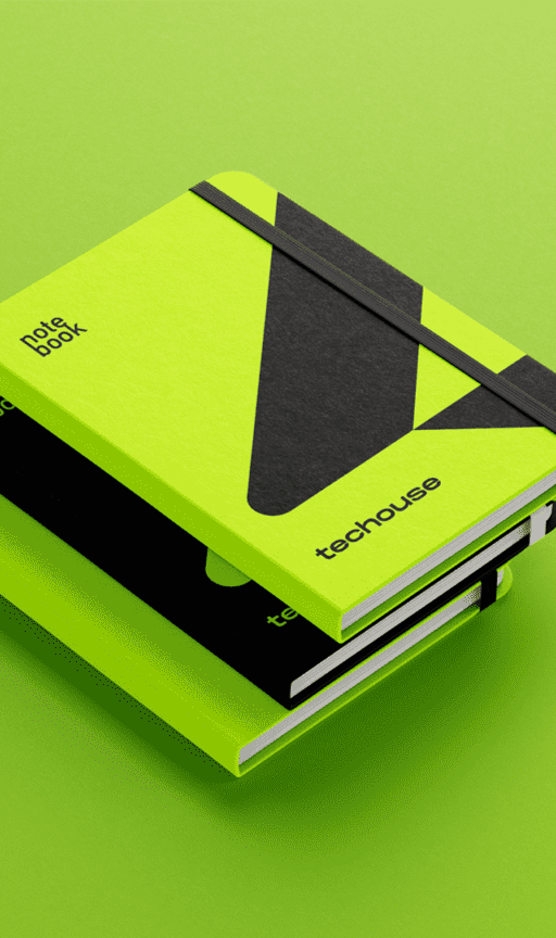
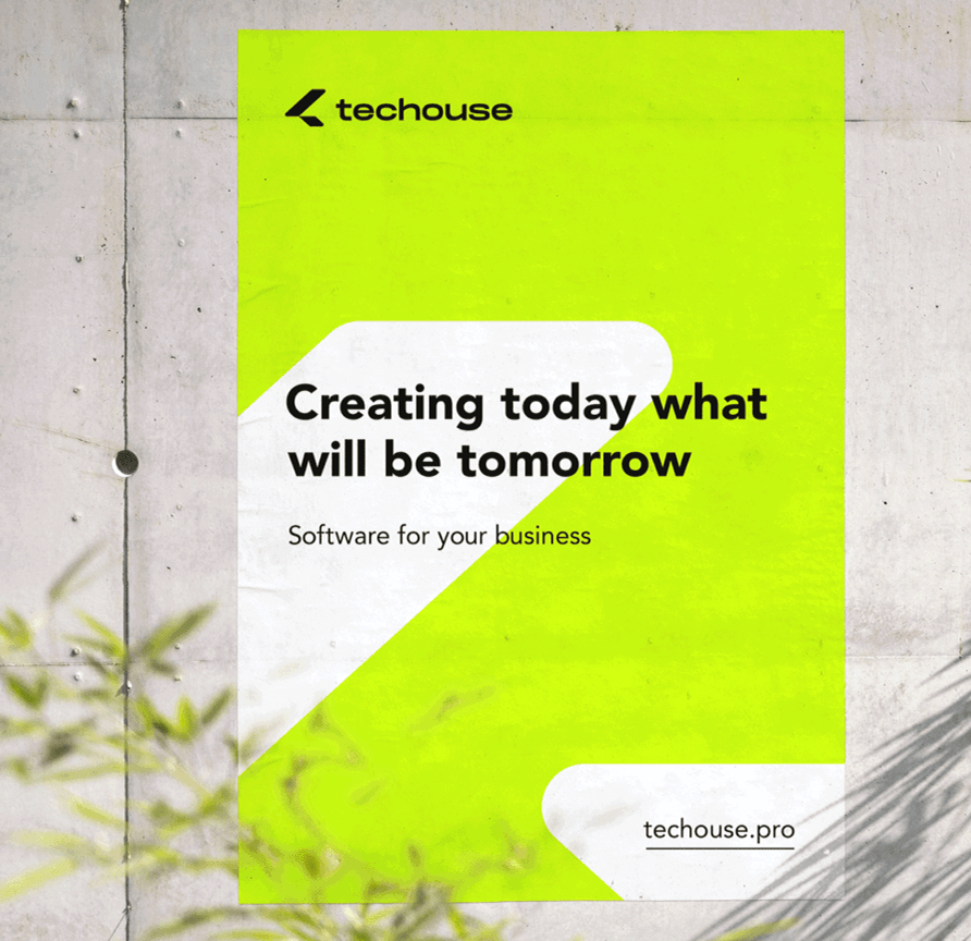
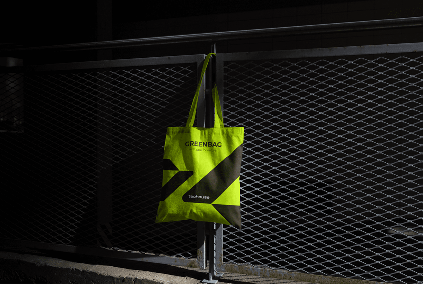
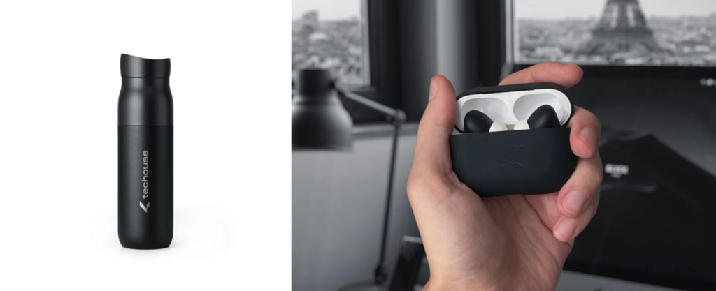
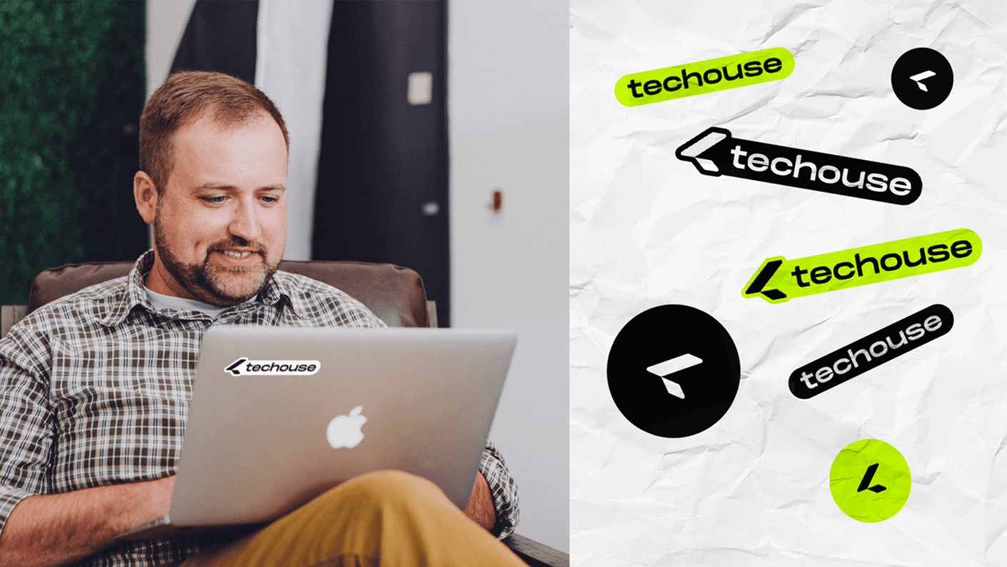
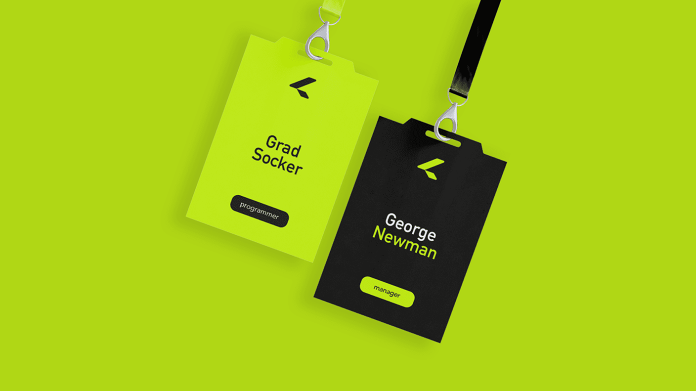
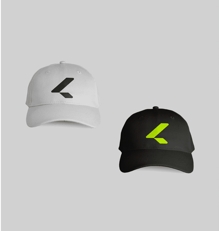
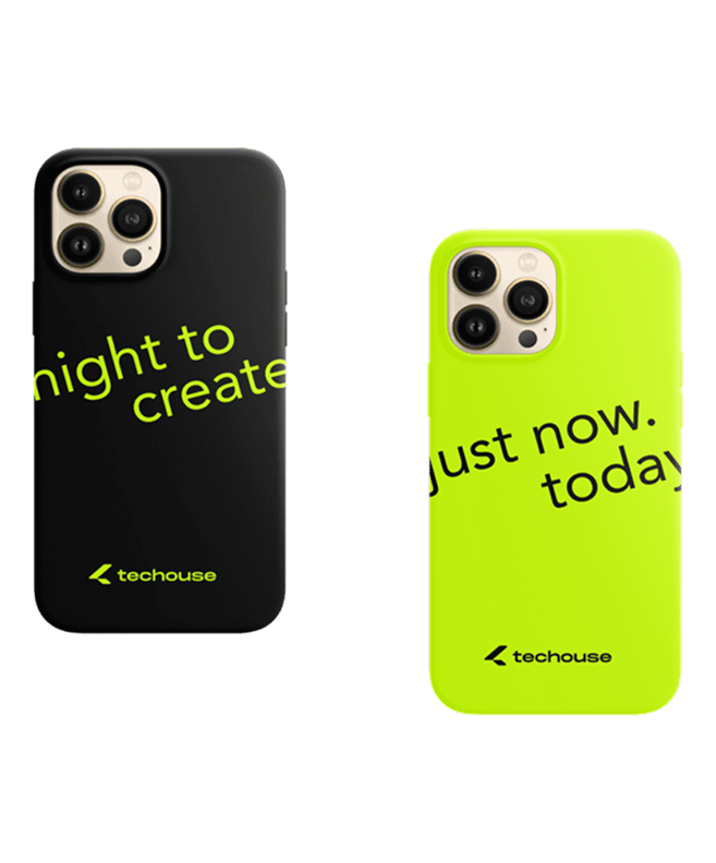
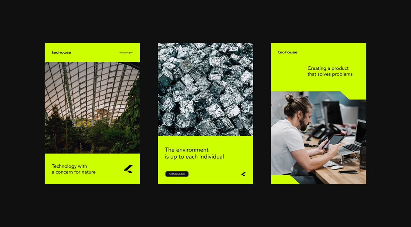
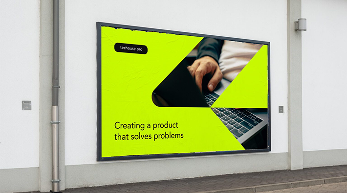
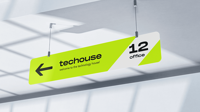
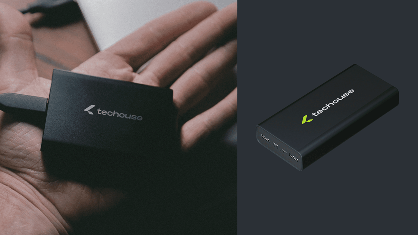
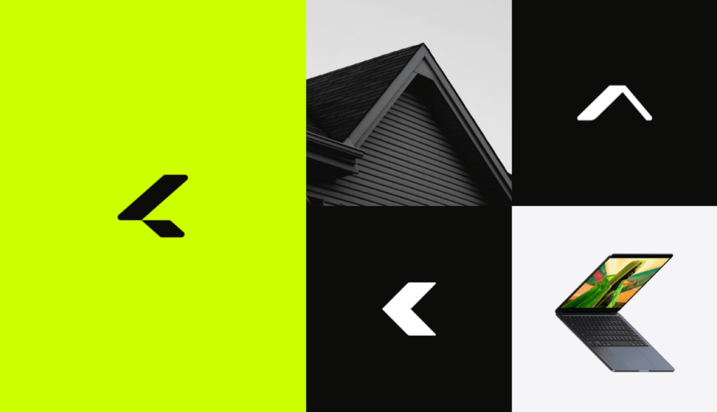
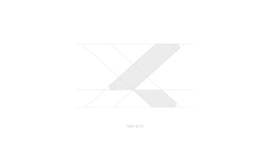
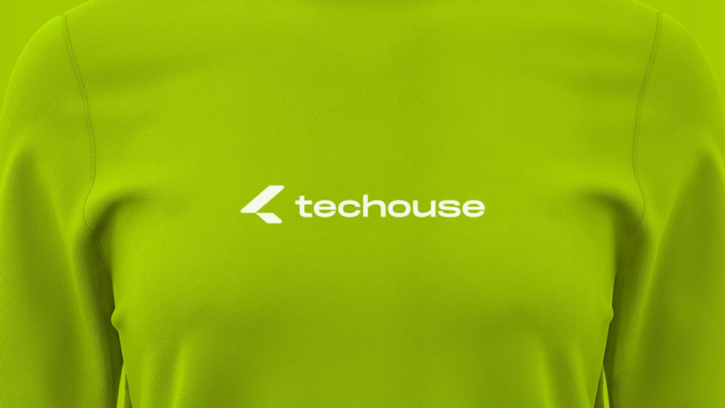
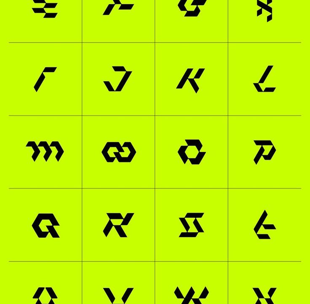
Based on the brief and market analysis we developed a logo and brand identity of the company. They represent all necessary requirements: environmental friendliness and are technologically oriented. There are two words in the company name – tech and house. We created an association map of those words and symbols for them. The first reflects a roof of a house and the second a laptop. Having joined the symbols together, we got a minimalist sign. The chosen light green colour connects the company with eco-friendly products. We developed brand communication media as well. Customers and employees of the company will easily remember them.
Brand
IT company develops mobile apps and web sites. The main emphasis is on eco-projects. The task: develop a logo and brand identity of the company. The key requirements: the logo should be technological and the brand identity has to represent its positioning – environmental friendliness.
Based on the brief and market analysis we developed a logo and brand identity of the company. They represent all necessary requirements: environmental friendliness and are technologically oriented. There are two words in the company name – tech and house. We created an association map of those words and symbols for them. The first reflects a roof of a house and the second a laptop. Having joined the symbols together, we got a minimalist sign. The chosen light green colour connects the company with eco-friendly products. We developed brand communication media as well. Customers and employees of the company will easily remember them.
Web
IT company develops mobile apps and web sites. The main emphasis is on eco-projects. The task: develop a logo and brand identity of the company. The key requirements: the logo should be technological and the brand identity has to represent its positioning – environmental friendliness.
Based on the brief and market analysis we developed a logo and brand identity of the company. They represent all necessary requirements: environmental friendliness and are technologically oriented. There are two words in the company name – tech and house. We created an association map of those words and symbols for them. The first reflects a roof of a house and the second a laptop. Having joined the symbols together, we got a minimalist sign. The chosen light green colour connects the company with eco-friendly products. We developed brand communication media as well. Customers and employees of the company will easily remember them.
IT company develops mobile apps and web sites. The main emphasis is on eco-projects. The task: develop a logo and brand identity of the company. The key requirements: the logo should be technological and the brand identity has to represent its positioning – environmental friendliness.